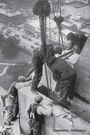
Since 2004 we have been creating some great postcards, notecards, mugs and magnets featuring awesome nostalgic Canadiana. CanadianCultureThing set out to explain visually what Canada was and is. We wanted to remind Canadians how amazing we are as a people. It seemed that it was more likely that a Canadian would have one of Lewis Wickes Hine’s photographs of the construction of the Empire State Building in 1931 hanging on their wall than similar photos of the Canada Life Building in 1931! We wanted to change that.
We wanted to do something interesting and historically important. We wanted to produce everything we made in Canada (it seemed kind of weird to produce the CanadianCultureThing in another country). And lastly, it had to be cool.
So far, so good.
How is it possible to define Canadian culture you ask? Simple…And complicated. I guess it’s like this: Canada is made up of all kinds of people from all kinds of places yet it still remains Canada and the things that occur here are still distinctly Canadian. What is it? Without trying to define ourselves by what we’re not, it’s kind of like we’re the Vulcans not the Romulans and the people who come here want to be Vulcans too. Nerdy but true.
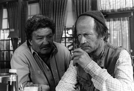
Years ago, I was home sick and was channel surfing. I surfed upon the 1981 documentary “A Whale for the Killing” about Farley Mowatt and the whale he tried to save. While now is not the time to talk about the subject, it was the setting of the documentary that I found so compelling. Canada. While the story was tragic it somehow got a warm and fuzzy feeling. Unlike watching other old shows that look distinctly Canadian – hoserish even, like The Littlest Hobo or The Beachcombers, this documentary referred to places I knew, streets I’ve walked down – there was nothing vague about it and I loved the feeling of belonging that it gave me. I wanted CanadianCultureThing to have that same effect.
Going forward I will be featuring the pictures I’ve used, giving their history as well as historical bits on the times in which they were originally produced. The interesting articles that were contained in the some of the magazines, the way Canada used to promote itself are sometimes so amazing but have no simplified place other than in an archive. I love advertising and during the first half of the twentieth century there was so much crazy advertising that it worth a look. I’ll try to use pictures whenever I can to explain what I’m writing about.
Please feel free to let me know if I ever make any mistakes because I can and sometimes my sources do as well. History tends to be a bit like broken telephone so if we can right a wrong that’s always valuable. I’m also very interested in pictures that anyone out there might have. Personal pictures that feature things of interesting Canadian content as well as previously published images.
Thanks for the visit and I hope you come back.
Chadwick Gendron


Your postcard of the Leafs playing the Bruins is inaccurate in that it states the image is from c1967 when in fact it would date c1961-61.
That is surprising as it appears that Bobby Orr is playing for the Bruins along with Dallas Smith #20 in Orr’s rookie 1966-67 season. Let me know if you have any indicators that it is 1961. Thanks for the input.
Here are the indicators:
-#4 is Pat Stapleton not Bobby Orr who played defence for the Bruins from 61-63 and wore the hallowed number during the 62-63 season.
-the Leafs sweater logo does not have a visible blue outline around the inside perimeter of the Leaf. Actually it has a single thread thickness in this year. After the 1962-63 season a thicker and more pronounced outline appeared around this multi-point Leaf on the jersey.
-#20 is Leo Boivin who played from 1955-66 for the Bruins
-that looks like Bruce Gamble in net by the way he tapes the end of his stick and the label on the catching glove. He played for Boston during the 1961-62 season. (Unlikely, but maybe Don Head as well- he is my second choice).
-The Bruins Northland sticks had two stripes near the blade in 1961-62, there were three stripes by the mid-60’s.
-the mid-60’s Bruins gloves had a V – shape made out of small circles on the front of the gloves. Early 60’s gloves had solid bands of colour running horizontally.
-reference https://torontoist.com/2011/11/a-gardens-gallery/20111130bruins7527/ the script is interrupted by code but there is enough to date it correctly.
I hope this is helpful
That’s awesome information! I credited the photo as the source credited it but I will update it when the postcard is reprinted. Thanks for the thoroughness.
Happy to be helpful!!!
I just came across your postcards today… wow!! I love them so much. I love cheesy old postcards and I’ve always thought more should be reprinted. That they’re Canadian is even better! Thank you!!!
I really like your site and have added it to my blogroll. Look forward to exploring CCT further.
Best, Brett
I forgot to link to http://tkmorin.wordpress.com/awards/ 🙂
I have nominated you for an blog award … I really like your blog! 🙂
Really cool site you have here! I am glad I “happened” on it. 🙂